

The new Contrast Paints are almost here, and I was lucky enough to get an early go at using them as well as a review set to play around with. So what do these new paints bring to the table?
While ago Games Workshop invited myself, as well as a number of other well known painters, to the Studio in Nottingham for a special Painters Weekend. Going into it I had no idea what to expect except that it involved something new for the hobby range. I was definitely blown away when they revealed the Contrast Paint range. The first day they demoed the new paints for us and explained a bit about what they are and can do, but the second day is when we got to take a shot at slinging some of the new paint around.
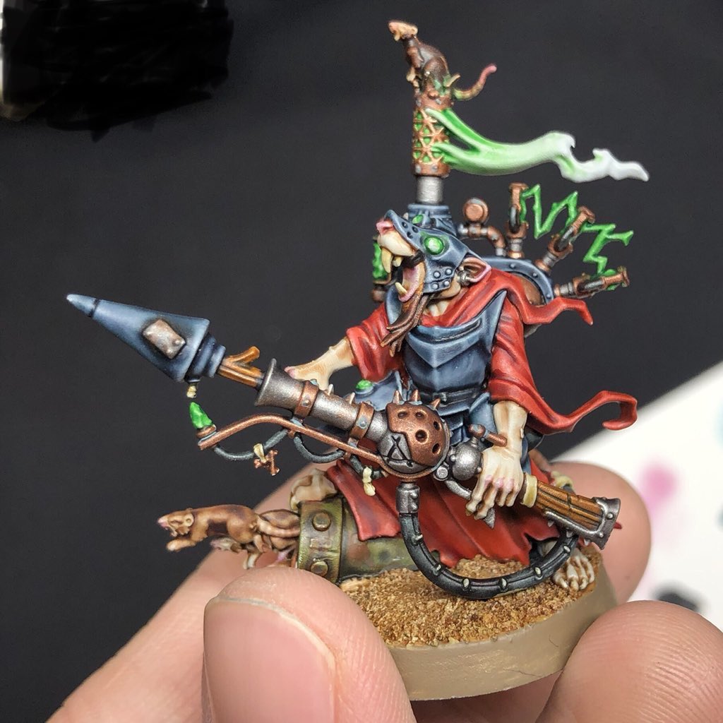
One of my first impressions was, "This is a lot like how I already paint with the Shades!" Which was great, since it meant I knew exactly what I wanted to do with the paints right away. We had a few test models to work on, and after messing around a bit with the paints in general I decided to try and paint up an entire model using just the new paints and no highlights. I was super happy with how the Skaven Engineer looked in the end and could definitely see pumping out an entire army this way. It was really fast too!

Fast forward to just the other week and I got a set of the new paints in the mail to try out on my own at home. Unfortunately the Contrast Medium and Wraithbone and Grey Seer paints in the pots were delayed slightly, which limited what I could do a bit. I used the Medium on a few of the colors on the Skaven, especially for blending, like on the smoke and tail. Blending with these is going to be super easy. You basically put a bit of the Medium down on the model where you want the fade to be, then put the Contrast color down on the other side of it and use the medium to fade the color out into the basecoat. The smoke on the Skaven is just a single green on top of the Grey Seer basecoat done in this manner and it only took me a minute to do.

I also used the base paints in the pots to tidy up a bit in places, such as re-basing the teeth before painting Skeleton Horde over them. These paints should be with me soon though, most likely later today when I get home! So I'll be able to show you some more advanced stuff in the coming days. Even without these though I was able to do a ton with the Contrast paints just straight out of the pot. I picked a selection of models to try out and primed them all up, some in Wraithbone, some in Grey Seer, and some in Corax White. The first one I decided to try was a Steel Legion guardsmen. This guy was primed Wraithbone. I went through and painted him up with just Contrast paints first and snapped a picture before moving onto some highlights.
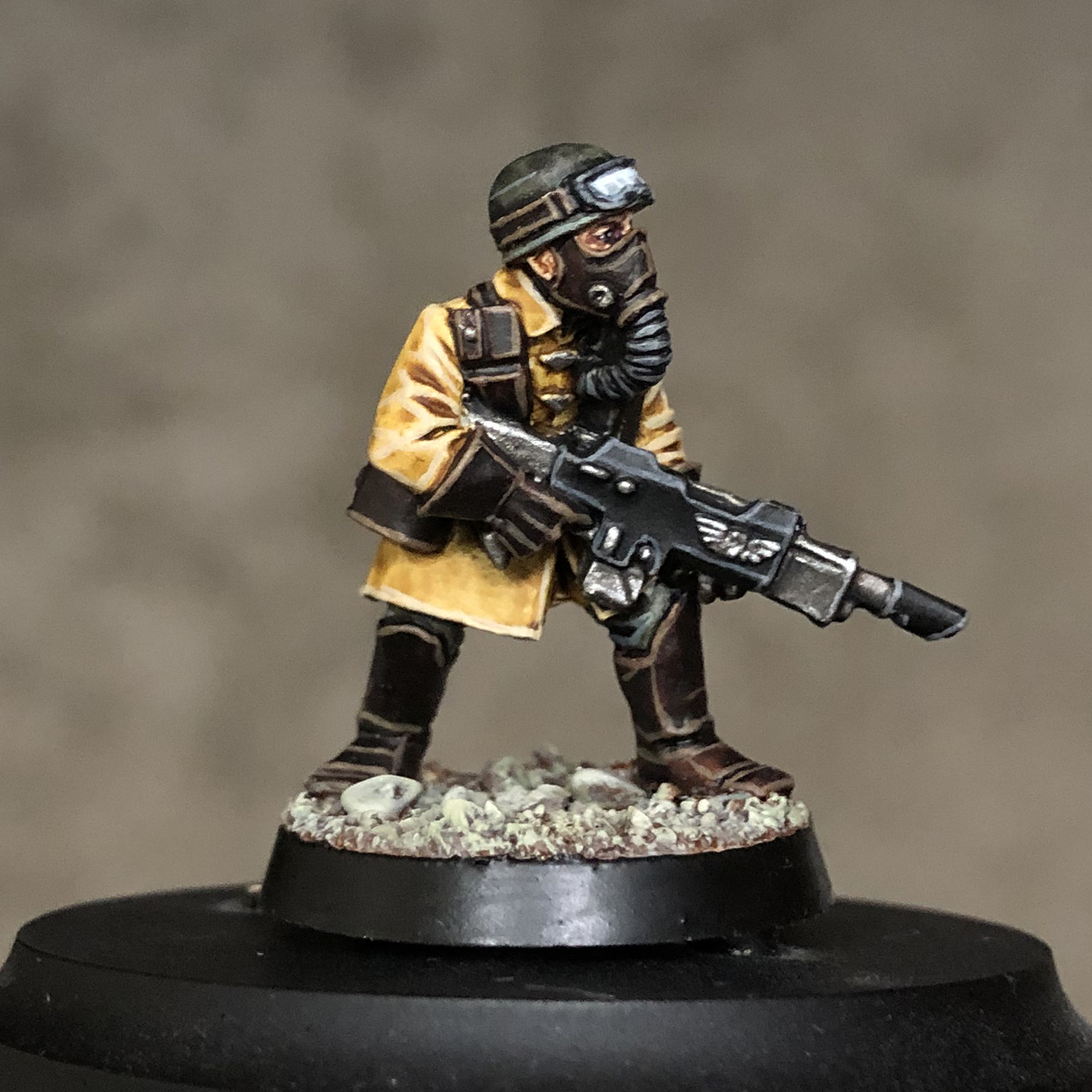
While he looked good with just Contrast, I thought he could use a bit of sharpening up, so I went in for some highlights. The coat is Aggaros Dunes, the leather is Cygor Brown, the gun casing is two coats of Black Templar, the skin is Guilliman Flesh, and the helmet and pants are a 50/50 mix of Creed Camo and Basilicanum Grey, followed by another coat of the grey because I wanted more of a grey green look. Once that was all done I carefully painted in the metal areas with Leadbelcher and gave that a wash of Nuln Oil. You could definitely leave it here if you wanted.
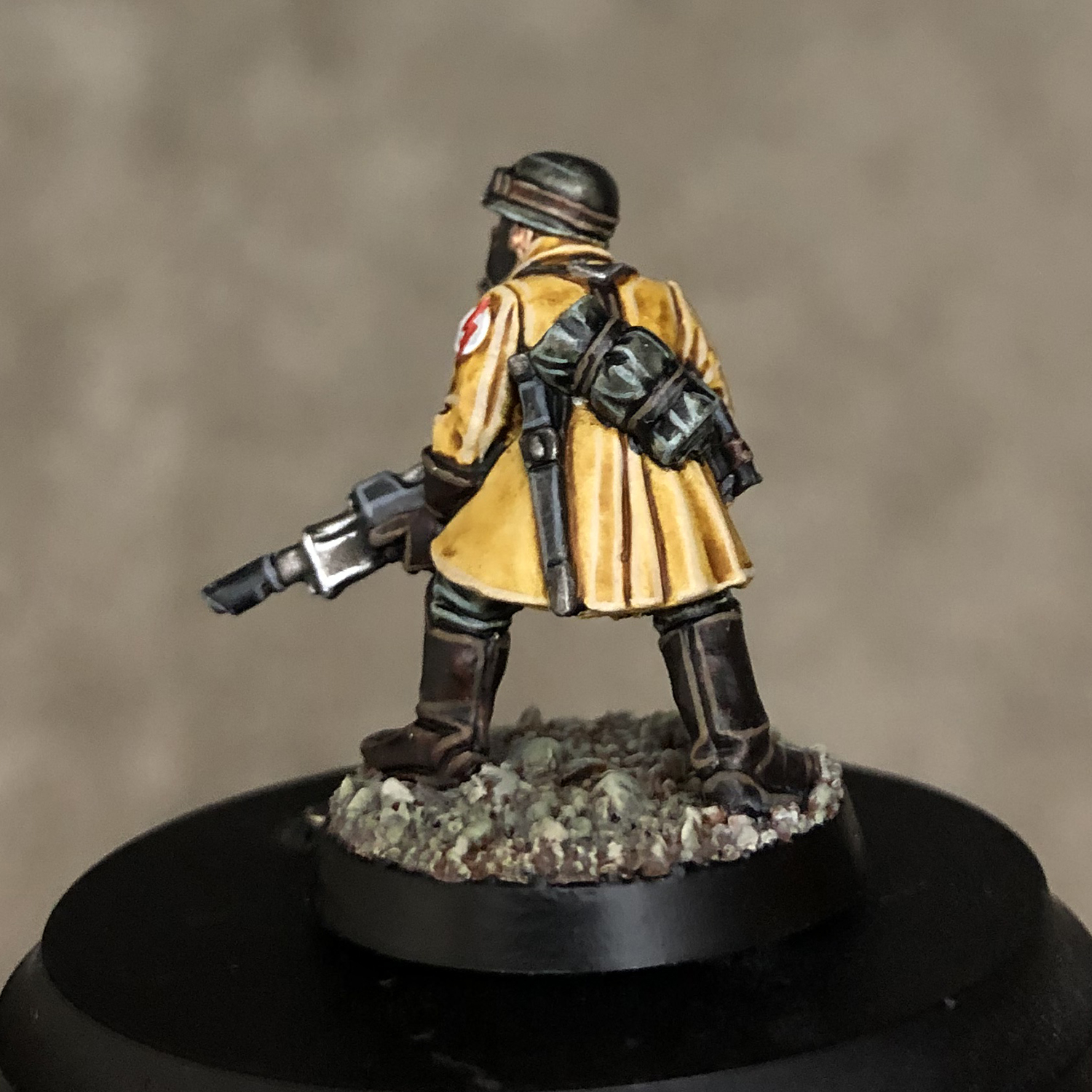
I decided to go back in an give everything a single edge highlight though. This was really pretty simple and really helped sharpen up the model. When I put him next to my Steel Legion officer which I painted the traditional way, he looks slightly different, but not in an extremely noticeable way, especially not when on the table. I feel like this means I could mix and match the styles if I want, painting all of the grunts with Contrast and spending more time layering for the characters.

The next model I tackled was a Kairic Acolyte. I have already painted one of these up using washes for the skin, so I expected substituting in Contrast would work well. Let me tell you, I am amazed by Guilliman Flesh! This is just one coat. It looks great and you could get away with doing nothing else to the skin if you wanted. This was all done over Corax White since I already had this guy primed from a few months ago.

The armor was painted with Ultramarines Blue, while the skirt was painted using washes and Lahmian Medium. I decided not to use Contrast here for a few reasons. I wanted it to match the look I had already made on previous models, and I wanted a more subtle look, since it's just some diluted Nightshade in the folds of the Corax White skirt with some simple white highlights.

I also wanted to see how it looked when I mixed in another style on a Contrast model. I think the two sit alongside each other very nicely. The gold is Retributor Armor washed with a 50/50 mix of Reikland Fleshshade and Reikland Fleshshade Gloss, while the silver is Leadbelcher with a Guilliman Blue glaze. Again, on this model I only did a single highlight over each color. The skin for example is just Pallid Wych Flesh and the blue is Blue Horror.

The last model I finished before writing this is a Stormcast Eternal. I wanted to see what I could do on a model with more large, flat armor surfaces. This is where the paint can get a bit too blotchy if you're not careful. I basecoated him with Grey Seer and ended up doing two coats of Volupus Pink on it since I decided to make this guy an Astral Templar. The second coat helped darken it a bit more and also smoothed it out a bit. The leather straps of his tabard were done in a bit of an odd way. In the art it looks like they have a blueish black color, so first I did a coat of Gryph-charger Grey to give it a blue tint, then once dry covered it with Black Templar. In the end I decided it still wasn't blue enough, so I covered with a coat of Guilliman Blue glaze. Once I added some blueish highlights it was at where I wanted it.

I was really happy with how the cloak turned out, which is just a single coat of the Gore-grunta Fur for the main color and Cygor Brown for the stripes. These paints work wonders on highly textured areas like fur, and organic objects.

I decided that I wasn't going to bother with a non-highlighted version of this model because I thought it really needed the highlights to bring it to life. Since there are so many smooth surfaces on it, the Contrast Paint can't make it pop as much as it did on the other two models. It still cut my painting time down significantly though, since it eliminated a lot of base and shade work. When I painted the metals, which are a base and shade, it felt significantly slower than the rest of the model.
I'm excited to keep experimenting and trying out new colors. Once I have the Medium and base paints in the pots I'll be able to push things a bit more and I think I'll be able to do a few more models without any additional highlights like the Skaven that look just as good. While these paints aren't the answer for every situation you'll come across while painting, they definitely help out with a vast majority of them! Since I already have a paint scheme down for my Death stuff that didn't use any Contrast Paints I probably won't be painting any of those models using a ton of these since I want my stuff to look consistent, but if I come across colors or textures that I haven't painted before I'll definitely see if Contrast can be used in those parts. I'm also really tempted to try and knock out my Steel Legion project which I had shelved indefinitely since it'll go so much faster. I kind of want to paint up my Tzeentch stuff finally as well, and Astral Templars are looking awfully cool.
Until next time,
Tyler M.
No comments:
Post a Comment