Welcome back to Mini of the Week, where every Friday I will find a miniature from around the web that exemplifies an aspect of our hobby and share it with you.
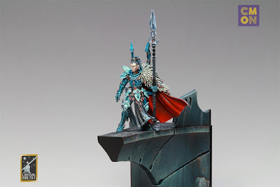
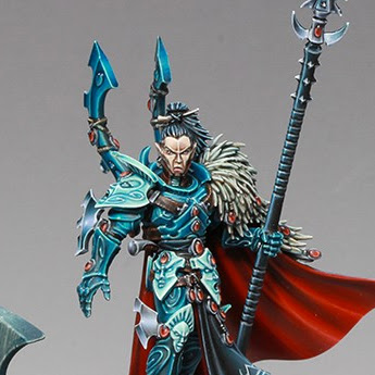
Neil has been on our site before, so his work is no stranger to the Mini of the Week. This Dark Eldar mini is pretty amazing, and the judges and public seem to agree since it took second place in the single figure category at this year's Crystal Brush. The conversions on it are subtle, a new head, a new weapon and slight reposing of the arm, but to be fair, the base model is so good to start with, you don't really need to change a whole lot. I really like the color choices, with the vibrant blues of the armor and red of the cape really popping against the darker, more neutral display. I really like the variation in the blue on the armor, it keeps the color scheme cohesive and within the same color family, but is different enough that it breaks up the model and catches your eye. Even the non-metallic metals have blues worked into them, essentially making the only two colors blue and red. The face is warm red tones, very pale ones, but still with a red hue. The only other colors are the black tabard and the neutral fur on the shoulder. Everything is smooth and crisp, with some really beautiful non-metallics. When it adds to the model without trying to be the focal point is when it's hit that sweet spot, at least for me.
The display base is very thematic and sets the scene wonderfully, but is in no way distracting. You can tell it's eldar architecture, and the colors are definitely on the darker side, hinting at the Commargh used as the piece's title, but the attention is always on the mini itself, as it should be. Besides just the contrast in brightness and saturation between the model and the display, you also have a nice contrast between the weathering of the bridge and the pristine look of the mini itself. It helps make it feel real and lived in, and at the same time serves a more practical visual function to direct the eye. All around, this is a very nice model. I was lucky enough to get to talk to Neil briefly at Adepticon as well. Hopefully I'll see him again next year and have a bit more time to chat.
Until next time,
 |
| Commargh by Neil Hollis on Cool Mini or Not |
The display base is very thematic and sets the scene wonderfully, but is in no way distracting. You can tell it's eldar architecture, and the colors are definitely on the darker side, hinting at the Commargh used as the piece's title, but the attention is always on the mini itself, as it should be. Besides just the contrast in brightness and saturation between the model and the display, you also have a nice contrast between the weathering of the bridge and the pristine look of the mini itself. It helps make it feel real and lived in, and at the same time serves a more practical visual function to direct the eye. All around, this is a very nice model. I was lucky enough to get to talk to Neil briefly at Adepticon as well. Hopefully I'll see him again next year and have a bit more time to chat.
Be sure to check out more views of it on Cool Mini or Not and show the artist some love if you like it!
Until next time,
Tyler M.
For all of your own miniature needs visit Ministomp where you can get the entire Games Workshop product range. They also have frequent model giveaways on their Twitter account, so be sure to follow them.


No comments:
Post a Comment