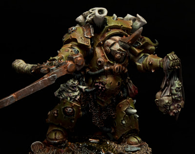
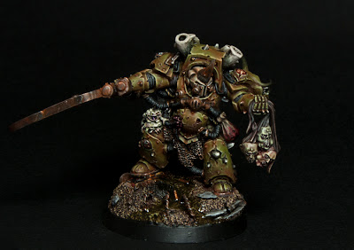
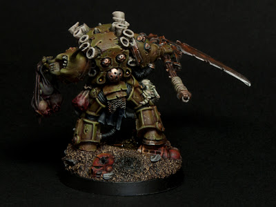
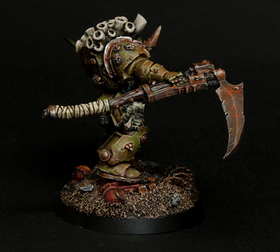
He is done! The Herald of Nurgle is now ready to sow death and disease throughout the False-Emperor's domain.
I finally finished my version of Typhus yesterday after I tracked down some water effects. I meant to post more pictures of him in progress but I just got kind of carried away with him. I am very happy with how he turned out.
I went with the classic scheme, giving him the off white helmet that the 'Eavy Metal team went with. I did this for several reasons, I think it looks good, it ties him back to the Death Guard's original color scheme, and its how I painted all of my other Terminators. I'm very pleased with how well my sculpting blends in with the model once its all painted. I was somewhat nervous that the weathering powders were going to destroy all of the careful blending and highlighting that I did but in the ends I think it works well.
I was also worried that the bright colors of the Howling Griffons would distract from the overall model, but after muting them with mud and rust I think it fits in nicely. I was pretty excited to add the water effects to his base as its the first time I have used it. Originally it was just clear but I added the green tint to help it stand out.
A few points of critique I am looking for:
How do the severed heads fit in? I am not sure on the color of the top head, I was trying to show different levels of decay on them.
How does the base work?
Should I add a blood spatter to the scythe? or more rust?
I am looking to enter this guy into the Golden Demon so be as honest as you can. You may have noticed the black background to the pictures which is a change for me. I decided I wanted to try a more dramatic look for him. I think it helps the colors pop more as well as setting a more somber mood. I also took some pictures with dramatic overhead lighting which you can see in the very first picture. They require some editing so I have only finished two angles so far.
Expect to see the rest at some point. I am going to post both types of lighting on CMoN to see which gets a higher score, a social experiment of sorts. Here is a picture with the traditional white background.
Which is better?
Be sure to vote for him on CMoN here.
Expect an update later in the week on some commissions I am working on.
Tyler M.


The second image I would say is my favourite, the white background one. It helps you see the colour of his armour, it's looks a lot more brown than the one with the black background, Overall though awesome mini, really inspired me to crack on with a nurgle project I had in mind :)
ReplyDeleteAgree with the above on the White Background.
ReplyDeleteThe Miniature itself is fantastic! The weathering has been done perfectly and the Rust effect is very well done, both of which fit perfectly with the Nurgle theme.
I would love to see some photos of him alongside some images of the cultists you painted before. Think they look awesome together in another one of those photoshop pictures that you did.
Love the paint scheme. I think you have captured the essence of Nurgle very well. The rust weathering on the armour looks brilliant.
ReplyDeleteI agree that the white colour scheme looks better in this instance. The black background accentuates the shadows too much and you are losing detail on the mini. I always find that white backgrounds work better against a darker paint scheme.
Good work and good luck at the Golden Daemons!